Project Details
Cient: Fortune 100 Drugstore
Team Members: Katrina Orlov, Shuning Wang, Preethi Gopalan
For this project, our team was tasked with working with a client to review the Beauty Department section within the mobile application. We reviewed competitors, interviewed users, and brainstormed and iterated on designs individually and as a team that would improve users' mobile experience when shopping for beauty products. Our findings and prototype were presented in-person to the client at the end of the two month project.
Our Process
Research
We performed the following activities to gain an understanding of our users, as well as the features of the client's current mobile application and its competitors' mobile applications
1. Usability testing of current mobile application
2. Usability testing and evaluation of competitors' offerings
3. User survey sent to individuals to better understand their buying process for beauty items
4. User interviews with shoppers who frequented our client's brick and mortar locations
Our research helped us define the problems we needed to solve to improve this experience. The top 3 issue we identified were:
1. People don’t frequently use apps for online shopping
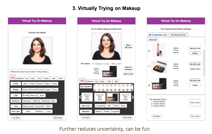
2. Users feel uncertainty when buying beauty products online - users cannot test product and see if it will be a good match for them
3. There is minimal guidance available in app for users who don’t know where to start when purchasing new products.
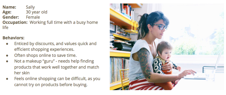
Defining Our Persona
Within Mural we developed individual personas based on what each of us felt the target user was. We reviewed and combined common themes to create our final persona, shown below
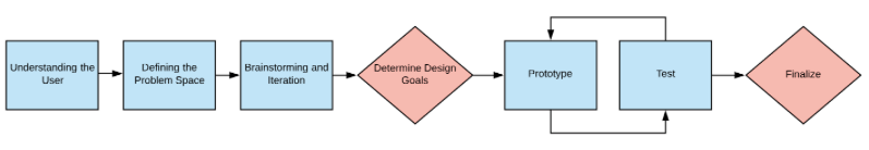
Brainstorming Sessions
Diverge
After our individual research we all had ideas of what would be the best approach to meet our users’ needs. We whiteboarded all of our ideas, and grouped them into categories which would become our specific focus areas for design.
Vote - dot voting was performed once we narrowed down our ideas. We performed this voting to decide on the 2 areas we would focus on, which were: 1) help customers made good decisions 2) help customers save time and increase convenience
8-Ups - We completed 2 rounds for 2 different areas of focus which were: 1) Help customers make good decisions and 2) Provide customers a more convenient and time saving experience
Silent Critique
We performed a silent critique as part of the 8 ups exercise - designs were passed around so that each team member could review and comment on each others’ ideas.
Group Critique
We discussed our ideas from the 8-ups and agreed on which ideas had the most promise. We each took our 8-ups and uploaded them to Mural in the Group Idea Parking Lot and decided that we would begin to sketch out the user journey through our preferred idea(s) and bring them to our next session, during the Converge phase.
Converge
Recap Background and Review Assumptions -
To begin our converge phase we used Mural to post virtual sticky notes about what each of us felt were key screens and features of the experience we were designing.
Identify Alternatives and Team Sketching -
For our first team sketching exercise we drew out our expected user journey flow on a whiteboard, and discussed differences in ideas for the ideal flow of our screens.
Wireframes
Design Goals:
Create added value within the app to enhance mobile and in-store shopping experience.
Provide guidance to assist users in finding the right products for them and reducing uncertainty
Create platform for consolidated and fast-access informational content useful to beauty consumers
Increase awareness of the wide variety of brands and speciality products available
Our Vision:
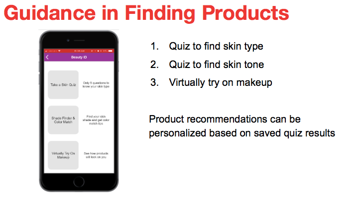
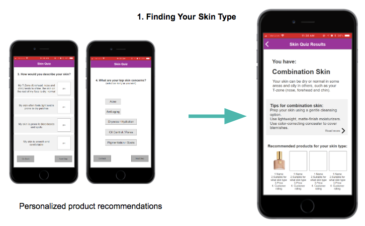
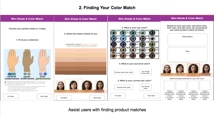
Provide a guided process to assist users in finding the right products for them based on their skin type and tone
Provide personalized product recommendations across all beauty categories
Increase helpfulness of product reviews
Create content with beauty tips and tutorials that correlate with products
Highlight the wide variety or brands and speciality products available
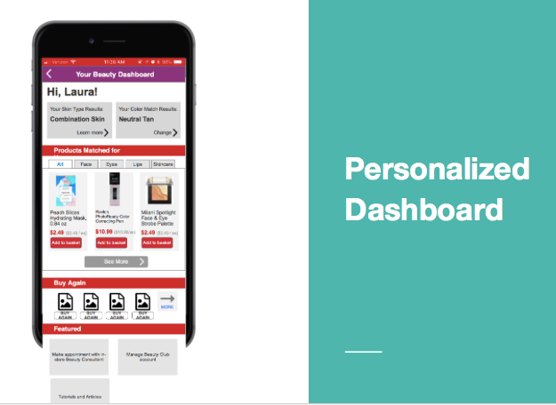
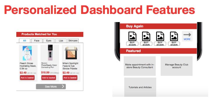
Allow for tracking of ExtraCare Beauty Club points, past purchases, and new product recommendations in one easily accessible interface.
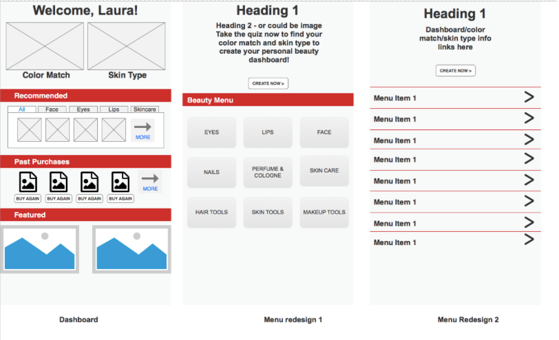
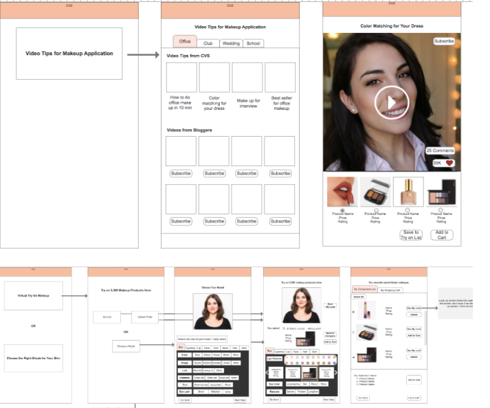
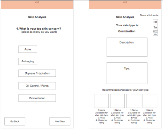
Our Designs
Feature 1: Finding Your Match - Helping the target persona easily find products that match her skin type and tone.
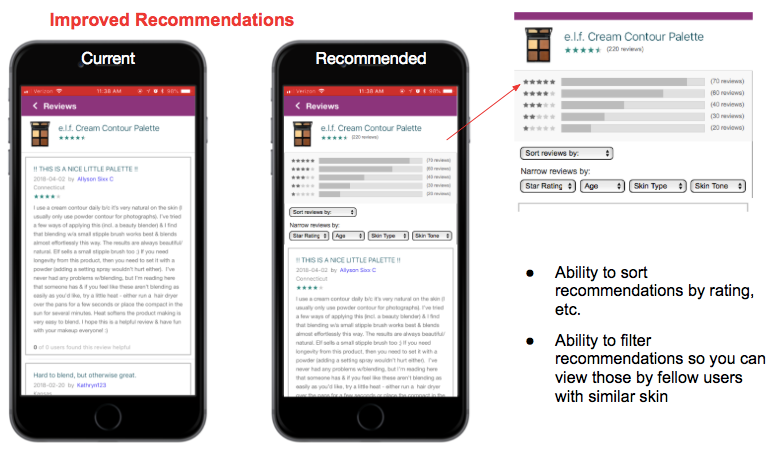
Feature 2: Finding The Information You Need - Providing more informative product reviews and improved product information
Feature 3: Personalized Dashboard - allow users to reorder past purchases, get recommendations, and track their color matches all in one place.