May 2019
Co-creators: Michele L’Heureux, Harry Krug, Derek Mei
Purpose
Evaluate the information architecture of pilgrim-monument.org. Propose redesigned navigation, content structure, and search engine optimization to significantly improve users’ wayfinding capabilities and better promote the features of the organization.
Scope and Process
We created our prototype using Figma, and then imported into InVision to create an interactive (clickable) product. The goal of this project was to create a low to medium fidelity prototype that focused mainly on navigation (header, footer, and utility navigation) and content organization to allow for better wayfinding when trying to complete these 2 tasks:
1. Viewing and purchasing tickets for special events
2. Finding out general information about the museum to understanding what you will see there, and then purchasing tickets, viewing the location’s hours of operation, and getting directions if necessary.
First, we needed to understand the current site map and identify any issues. Below is the current site mapping as of May 2019
Current Site Map
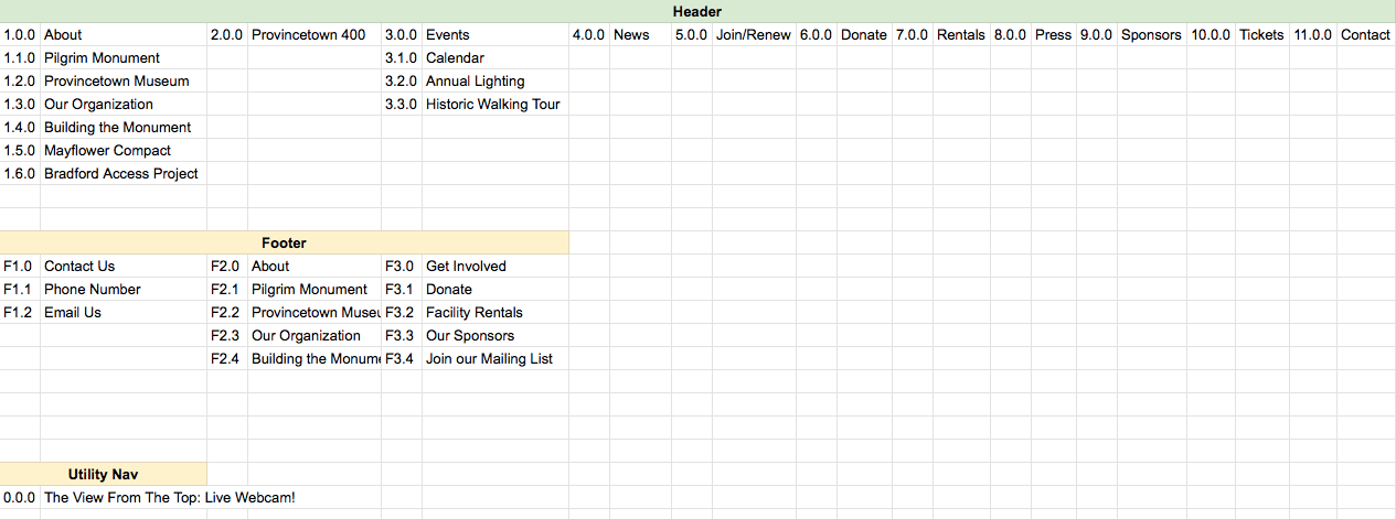
Next, we needed to identify how we could fix the issues we identified. Some of the main issues found were:
Navigation Menu:
1. Menu items were long sections of text, causing the text to wrap onto the next line when viewing the site, making it difficult to determine the number of items at a glance.
2. The mobile site has the same navigation as desktop navigation, but groups with child items cannot be collapsed, inducing cognitive overload due to the number of items. Visually, groups are highlighted using a gray background which is difficult to read. Additionally, clicking on an item instantly collapses the menu, and then redirects a user to the page, which is confusing.
Lack of Ordering Principles:
1. The order of the primary categories is not intuitive. One primary use case would be to visit the monument and museum; however, Tickets is placed far right, away from About.
2. Press and News are separated by multiple other items. Tickets and events are separated as well.
3. Provincetown 400, a separate site for an anniversary event, is prominent, overshadowing other primary tasks.
Labeling and Ordering
1. Within the About category, the subcategories are seemingly random, with no apparent ordering principle.
2. Subcategory labels could be more concise and avoid the use of extraneous words like “the” and “Our.”
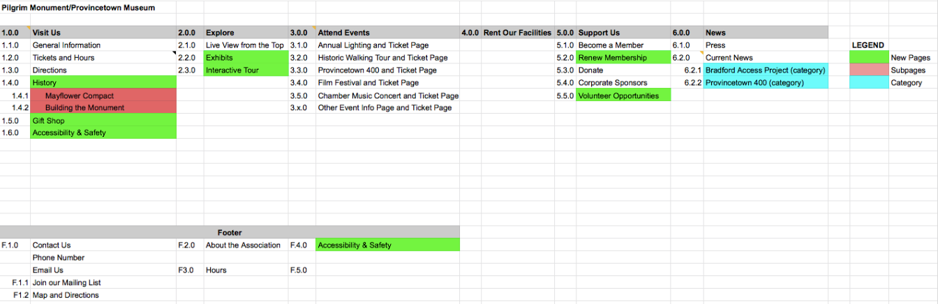
Recommendations
Based on our findings, we developed the below recommendations to focus on to begin creating our new site map:
1. Connect information about the venues, purchasing tickets, and getting directions, so users can plan their visit in one place
2. Create a clear path between the calendar, event descriptions, and ticket purchase. Avoid sending users to a new website/opening a new page to make purchases.
3. Create new way to highlight and navigate to Provincetown 400 site, as well as highlight other events.
New Site Map
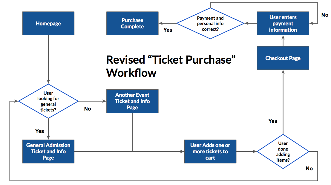
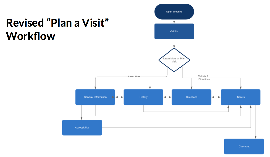
Revised Workflows
We created two workflows using LucidChart to assist with our understanding of how a user would complete the primary tasks and navigate through the process.
Desktop and Mobile Prototypes
Ultimately, we began to take our findings and ideas and translate them into a prototype. Our prototype focused mainly on navigation/wayfinding to plan a visit, view events, and purchase tickets, but also covered content organization and better promoting events and the features of the monument and the museum that were not well covered or difficult to locate on the current website.
Below, view our Mobile prototype: